Posts Tagged ‘choice architecture’

Nudges in action

December 15, 2009

1) Vail Resorts, partnering with the National Forest Foundation, adds $1 to each Vail Resorts season pass or overnight stay at a Vail Resorts property, which guests can ask to have deducted from their total. (Hat tip: Brandon Hough)

2) Whole Foods has a similar donation program called One Dime at a Time where customers can have the 10 cent refund they receive for each renewable bag be given to a local charity. Unlike the more popular opt-in programs, One Dime at a Time operates along a mandated choice paradigm where customers are asked if they’d like to donate their refund to charity. Of course, the social pressure that comes with publicly asking a customer if she would like to keep or give $0.30 on her $50 grocery bill to a local and worthy cause probably plays a role in encouraging donations.

3) Target turns the self-service checkout register into a game in order to encourage faster scanning by its customers. (Hat tip: Inge Kuijper)

4) In order to see the top free apps at Apple’s App Store, you have to see the top paid apps too.

5) The Australian mobile phone company Optus charges customers who want paper bills and doesn’t provide a direct link to the electronic bill in the monthly billing email it sends customers. Instead, customers have to navigate through a series of ads promoting Optus services to reach their bill. (Hat tips for 4 and 5: Jeromy Anglim)

Menu design tricks to get you to spend more, part II

December 14, 2009

In a must read for foodies, New York Magazine points out eight menu design tricks in its current issue. Many of the tips aren’t new (see here), but it’s worth reminding diners to beware of the extravagant item. Not because diners will buy it, but because they’ll buy something next to it.

2. The Anchor
The main role of that $115 platter—the only three-digit thing on the menu—is to make everything else near it look like a relative bargain, Poundstone says.

3. Right Next Door
At a mere $70, the smaller seafood platter next to Le Balthazar seems like a deal, though there’s no sense of how much food you’re getting. It’s an indefinite comparison that also feels like an indulgence—a win-win for the restaurant.

4. In The Vicinity
The restaurant’s high-profit dishes tend to cluster near the anchor. Here, it’s more seafood at prices that seem comparatively modest.

Hat tip: Daniel Lee

Yea or nay: Vote on a proposed parking lot nudge

November 18, 2009

Reader Richard Whittington passes along an interesting idea he has for revising parking lot choice architecture. The basic proposal is to narrow the parking spaces closer to store entrances. Whittington explains two benefits.

Make parking spaces that are closer to store entrances narrower for the first 20 spaces, then get progressively wider up to the standard width 40 spaces from the entrance. People would park further out from the entrance because it would be harder to exit the vehicle close in and they would not care to have an older banged up vehicle bang up their nice vehicle. It would get people to walk more for better health. Handicapped spaces would continue to be the same large size but would have to monitored much more closely by parking violation dept. This would increase revenue to the city or county. Two, I think, good results from this small action.

There are many ways to tweak this idea for different types of stores and communities. There are also many behavioral consequences, pro and con, to consider. The Nudge blog thinks the heart of the matter is whether a parking lot painted in this way would alienate customers. Let us know what you think by voting in our online poll below.

Confusing choice architecture: Don’t text, but check out our tweets

November 17, 2009

Talk about mixed messages.

At least 22 states that ban texting while driving offer some type of service that allows motorists to get information about traffic tie-ups, road conditions or emergencies via Twitter.

Sadly, the Nudge blog’s home state of Illinois is one of them. Full story here.

The National University of Singapore nudges

September 9, 2009

Marcus Tay Guan Hock, Sustainability Executive at the National University of Singapore, writes in to say that Nudge “gives me hope as an environmentalist,” and explains how the school used principles of choice architecture to redesign its recycling program.

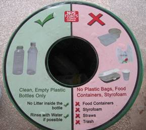
Here at the National University of Singapore (NUS), we designed our recycling bins to tackle the issue of contamination, applying what you called “Expect Error” from users.

When users throw the wrong things in the recycling bins, it wastes the efforts of those who recycled properly. For example, paper bins are often contaminated with food waste, rendering all of the paper unrecyclable.

This situation is rather serious in Singapore. A Straits Times Article on June 15, “What rubbish,” indicates non-recyclable waste found in all 80 recycling bins surveyed.

At NUS, we did the following two things. They have worked wonders.

  • At the point of disposal, we help people decide if the item can be recycled using proper and clear labels. These labels are designed so that before users can throw trash into the bin, they will see the labels which instruct them what can and cannot be thrown.
  • trash bins 2 NUS

  • We give people an option not to throw garbage into the recycling bin if the garbage cannot be recycled by pairing every set of recycling bins with a trash bin as well. Because some people are not yet environmentally conscious, they just want to get rid of the rubbish in their hands, whether it can be recycled or not. trash bins NUS
  • What would it take to get you to take the stairs more? How about music and a view?

    June 23, 2009

    The stairs between the upper floors of the University of Chicago’s Booth School of Business are made to be used. They are placed smack in the middle of blocks of faculty offices. They zigzag back and forth up open columns, allowing people to see easily between floors. They have plenty of light, are carpeted, and blend into the design of the building.  By placing the stairs in a common area (the elevators are a longer walk away) and making them inviting, the architect created a nudge to encourage a smudge of healthier behavior in the work place.

    Creating more accessible staircases through public policy and physical architecture is one way to promote an active lifestyle, say Dr. Ishak Mansi of Louisiana State University, and his wife, Nardine Mansi, an architect, in the Southern Medical Journal. A small 2.8 percent increase in stair use would cut 300 grams of weight from a typical person, they say.

    So how does one design a building where people actually use the stairs? There are three key features.

    1) Fewer turns between the stairs and the closest entrance.
    2) Stairs with large surface areas (not too narrow and steep).
    3) Create a view, either up, down, or across, from the stairwell. No one wants to walk up a tiny, white box.

    The Booth School of Business staircases meet all of these requirements (perhaps it’s no surprise the building won a major design award last year). For those who can’t build new stairwells, there are a few other nudges to try. Displaying motivational signs in the lobby and throughout the building, and playing music in the stairwell can increase stair use. Together, these two nudges can increase usage by as much as 9 percent. Hanging artwork on the stairwell walls, closing elevators occasionally, and offering incentives like fruit are also known to work.

    The journal article is gated, but a short news summary is here.

    The dentist bib as choice architecture

    June 7, 2009

    Talya Miron-Shatz, a psychology post-doctorate at Princeton with Daniel Kahneman, recently received a crown and a root canal in the same sitting from two different dentists. Since the two procedures were separate from one another, neither dentist seemed to know the local anesthetic that the other was providing to Talya. With poor communication, Talya almost received a double dose of Novocaine (or something similar). There has to be a better way to prevent these kind of errors, she thought.

    And here’s my two cents for human engineering. Dental patients wear a bib around their neck. How about if the (dental) office purchased a Sharpie, and had each doctor write down how many injections he/she gave the patient, and their exact location. Better still, how about if this was pre-marked on the bib?

    Read the full post as Psychology Today.

    The choice architecture of Time magazine’s online poll of influentials

    March 30, 2009

    Time Magazine’s list of 203 finalists for the 100 most influential people in the world is out for 2009 and thanks to Nudge, Richard Thaler and Cass Sunstein are on it. Almost making the final list is a great honor for them, but in Sunstein’s household, he’s just playing catch-up (his wife Samantha Power made the final list in 2004).

    On Time’s web site, readers are able to help editors pick the influentials. Already, it is clear that the online rankings are quirky, and that’s not just because readers have ranked Thaler and Sunstein dead last as of Sunday March 29. A number of readers on Freakonomics have pointed out how awkward some of the choice architecture of the site is. Say you want to vote on who belongs on the list. Time provides a slider on a 1-100 scale that visitors can use to score influence. But you might be easily confused. Should influential people get higher or lower numbers. Seems like you’d want to give higher number to influential people; but the winner of any best/worst list always comes in at No. 1.

    Reader Tom notes that Federal Reserve Chair Ben Bernanke has an average score of 5. “People are interpreting the top 100 scale to mean 1 is the highest and 100 is the lowest,” he writes. E agrees that the slider is poorly conceived. “I started by sliding toward 1 to say the person has less influence (like 1%) and toward 100 for more influence…Now I think it’s ranking that the slider indicates, not ‘influence’ as the text indicates…. So I just gave up, not understanding the paradigm.”

    Initially, Time gave no guidance about how to interpret the scale. Since the site went online, Time has added a description to the scale that makes clear 100 is “most influential.”

    Meanwhile, a lot of people are voting for moot, the founder of the image bulletin board 4chan.org, and the leader with a score of 75. The Korean pop star Rain (he’s Korea’s answer to Justin Timberlake) finished second on the online poll, and is currently ranked No. 3. Online polls are one good way to open up the selection process to people, but they can be vulnerable to manipulation, especially when mobilized groups participate in small, relatively unknown ones. Basically, they are a highly flawed form of choice architecture.

    Comedian Stephen Colbert recently outwitted NASA by asking his viewers to write him in as part of an online poll to name a room on the international space station. One U.S. congressional member is backing Colbert’s win, telling the Chicago Tribune, “Funding for space exploration is something where getting the public’s interest is challenging, and having Colbert would bring interest to NASA’s program. Over a quarter of a million people or so came online to chime in on the naming question…It just shows what happens when you reach outside the normal circles.”

    Colbert is doing pretty well again in Time’s poll, holding steady at No. 4.
    Slang for “choice architect”

    January 30, 2009

    Courtesy of Philip Frankenfeld. Add your own…

    1. Nudgeletarians
    2. Noodges
    3. Noodgeniks
    4. Vectordictorians
    5. Chess Theorists
    6. Suasarians (Moral suasion)
    7. Carrot and Stickleteers
    8. Homo Vectoris
    9. Boxitects
    10. Funnelists (akin to finalists)
    11. Carrotodomists
    12. LibPats (libertarian paternalists)
    13. SofPats
    14. ComPats
    15. Gridologists
    16. Matrix d’s